Holly Grisman
Holly Grisman
Studying Games Art and DesignNorwich University of the Arts
About Me
Im 21 years old studying Games Art and Design at NUA in Norwich.
I am a Second year student, having completed my first year and now moving into my specialty of asset design.
My Qualifications
Level 3 Subsidary Diploma in Information Computing
Level 1 & 2 Certificate in Information Computing
Level 2 Functional Skills in English
Level 2 Functional Skills in Maths
University Work
Categories
College Work
Categories
Personal Projects
Categories
Games Years
Categories
Year 1 Sections
Categories
Concept Art - Character's Props
The first project of 1st year was to design 3 props for a character. I did mine based off an old character I had created previously.
Year 0 Work
Categories
Treasure of the Temple
This was my first unit I participated in for my Y0 games, and in this I had to create a 2D platformer game using Godot, with making all of the assets for the game itself
Melodies of a Memory
This was my final project for year 0 games design, which was primarily a concept art and storyline focused project, in which I had to create art for the characters and the environment, but also had to think a lot more about the world of the game and the story for it rather than just the art side of things.The main requirement for this piece of work, is it be relating to a global crisis, in my case I chose to create the game relating to Mental Health, and the bereavement support than young people receive
Game's Story
I won't go too into detail here, as the conceptual side isn't as necessary to discuss for the portfolio, but the games general idea was to have the main character, Melody, be struggling with her mental health following the sudden loss of her father. The game's play would involve interacting with objects around Melody's bedroom, taking her into "Memory States" where you complete tasks while learning more about her relationship with her father, and after these sequences are complete, you're tasked with helping melody calm herself down from her grief stricken mentality, until she can eventually feel calmer and more in control.
My hope was with this game, is that instead of just being a game to play for fun, it could be used as a tool that mental health services could use to show young people healthy ways of coping with their grief, but to also understand that having to deal with those emotions is a completely normal thing following a tragic life event
Character Design
Personally concept art isn't my strong suit, especially character design, but I did my best with what I had.For this game, I also took heavy inspiration from my real life experiences, and I even used an actual image from when I was younger with my dad as the inspiration image for the art of Melody with her Father
Games Work
Categories
Website Designing
As personal projects, I've created and maintained various websites. I've included descriptions, images, and a link to all of them below.
This Portfolio
As a starter, this web portfolio is a perfect example of one I have created and maintained since early-ish 2023 and have been updating through my college and university work, and will be updating with the rest of my uni work for games later on. This was all made in Carrd.
Game Blog
Another one that I worked on in 2023, although it wasn't updated for long, was a blog website with my partner reviewing games. This was all setup ourselves through WordPress from scratch, and was actually really fun to create and update with the reviews overtime.
Games
Mushroom Labyrinth
We weren't really taught anything on how to do this, rather just told to watch tutorials on how to use a game engine (college told us unity), so instead as I wasn't being taught directly how to do anything, I opted to use construct as i thought this would be a simpler way to create my game in the image that i had for it.
My game is based in a forest, with a dog collecting mushrooms while avoiding bears that chase you.
I had a lot of fun making this game although I didnt make the graphics myself as the project was to create a functioning game rather than the designs for it.
Various Screens
Event Sheets
These event sheets are really simple because there's not much that has to go into menus, especially when 2 of them are duplicates of each other with only having a slightly different line of text, therefore requiring only one sheet to work between the two of them.
Maze - Easy
The smaller maze is of course the easy one, with only one bear and 5 mushrooms for the player to collect.
You cant walk through the trees and the pink square is a safezone that the bear cannot walk through.
The way i designed the health to go down was very scuffed, as i wasn't taught anything about how to do this, i did it in a very awkward way. I had the health image as a gif that was paused, and every time a bear hit you it would play for half a second, to move to the next frame of the gif.
I did the same for the mushroom counter on both the hard and easy levels.
The bear's animations also never seemed to work properly, with them not using the idle animations at all and the walking ones playing at the wrong times. Sometimes they'd also be able to see you through the collision of the trees as i made their collision to their exact shape rather than a rectangle. This also means that you get stuck on the quite frequently.
Maze - Hard
The harder level is significantly more difficult, with a level easily 4 times the size and 9 bears to avoid, its designed to be a lot more difficult. Theres also 20 whole mushrooms to collect, and with the camera size being small, its hard to plan out routes that'll keep you safe.
The hard level really shows how badly i did the collisions, as you get stuck on most corners and some of the width's of the paths we're different sizes making them look inconsistent with each other.
Event Sheets for Levels
Most of these are the same for both the easy and hard levels, except from small changes like where bears pathfind to using the coordinates etc, so I didnt include them twice here.
The main changes between these are the mushrooms and the counter.
Overall i did really enjoy the project, especially as this was my first attempt at creating a game of any sort. This was one of the only units in my 3rd year of college that i actually enjoyed, and earned myself a distinction on.
This helped me realise that i enjoyed game design a lot, with having the most fun with this with creating the level design.As my first ever game project, im quite proud of it and feel that I did good work, especially as I had 0 help from tutors whatsoever.
Graphics Work
Categories
Doing Project
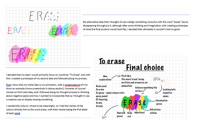
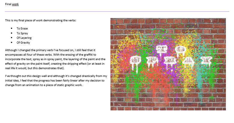
Our task with this project was to research and create a piece of art relating to a specific or multiple verbs from a given list.

Iterations of my first idea for my chosen verb

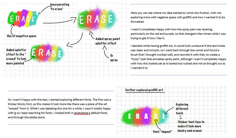
Further Exploring Ideas and fonts

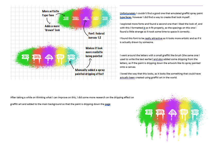
Enhancing the look of my work to make it look more dynamic and realistic

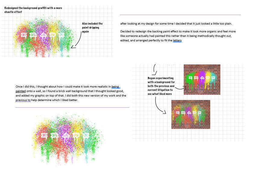
Redesigned my background art

Added a background + going into more detail from previous image

Testing different Verbs

After testing verbs, testing different font outlines
Doing Project - Final Product

After testing different verbs, testing with different font outlines
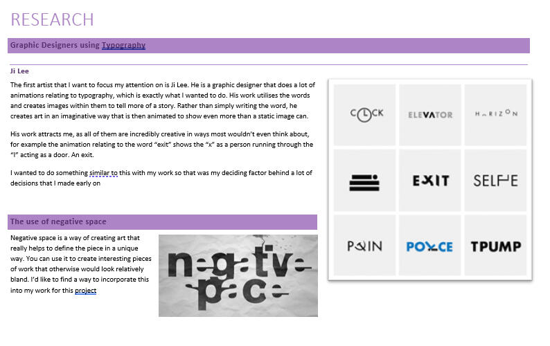
Doing Project - Research

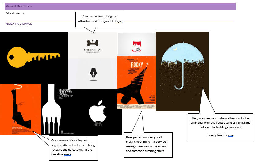
I initially started research on typography artwork and negative space

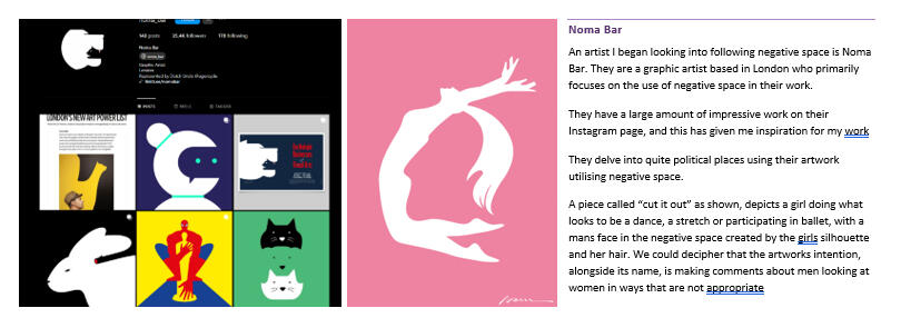
As well as artists that focus on those specific fields

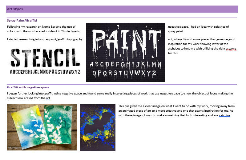
I then looked more into spray paint, the fonts and how graffiti is used with negative space

I created moodboards for negative space

And Graffiti

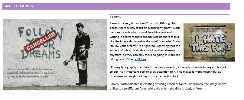
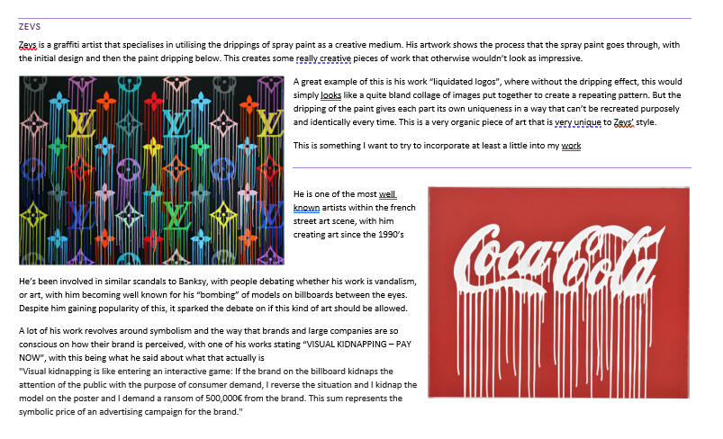
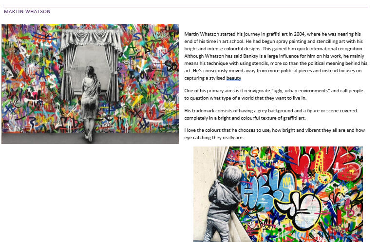
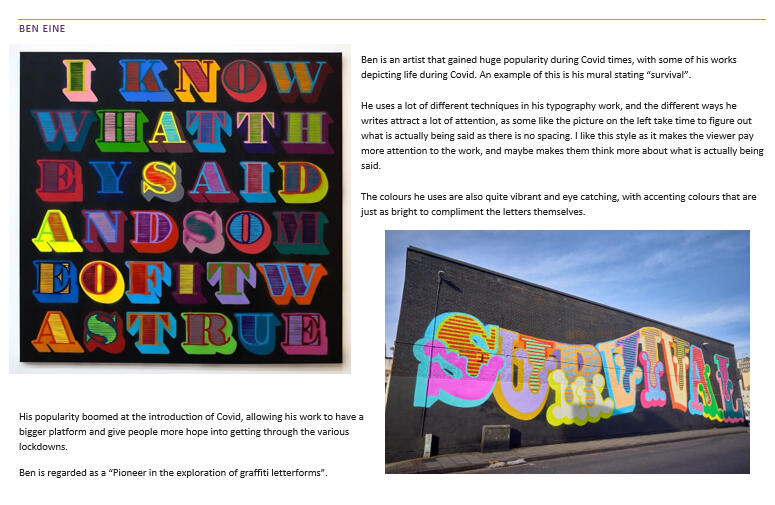
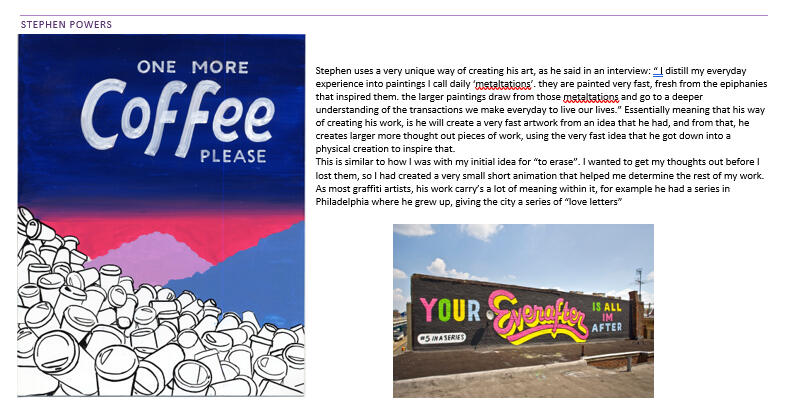
I then looked into famous graffiti artists and their work

Including Banksy and Zevs

And some others who utilised bright colours

Such as Ben Eine

And Stephen Powers
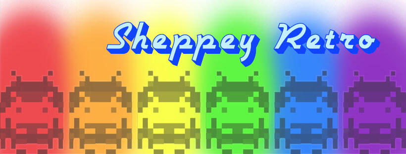
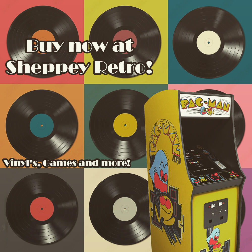
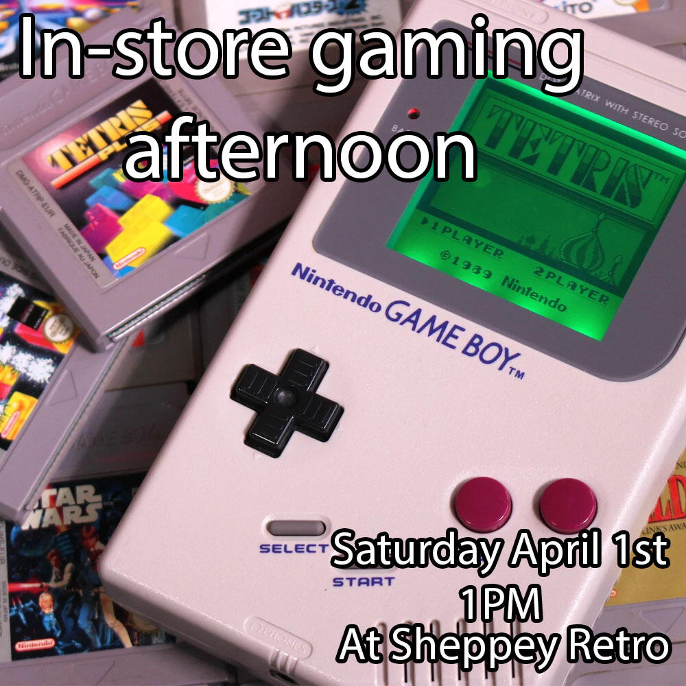
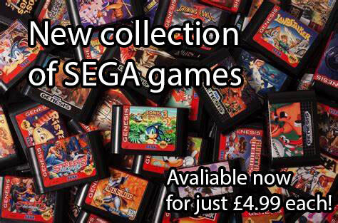
Social media graphics work based around a company called "Sheppey Graphics". I had to create all of their social media images such as profile picture and banner, as well as a variety of posts to advertise different products and events.

Social media banner for "Sheppey Retro"
Logo for "Sheppey Retro"

Social media post for "Sheppey Retro"

Social media post for "Sheppey Retro"

Social media post for "Sheppey Retro"
Work for a company called "Go electric". There were various requirements while creating this work, for example the logo needed to be green, while also including the initials for the company name. The poster, needed to advertise for their grand opening with all of their contact information provided.

Promotional Poster for "Go Electric"

Logo for "Go Electric"

Web banner for "Go Electric" to use as the banner for their website
Each year at college, I had to do something for a part of our local community. One year this was designing a logo for a railway line, the "Kent Downs Line" as a competition. Unfortunately I did not win, but I have included my work as I believe it looks very professional.
For another year, I had to create a promotional poster discussing the danger of trains, as if it was a real poster that could be seen at the railway stations. I included images directly from the British transport police website.
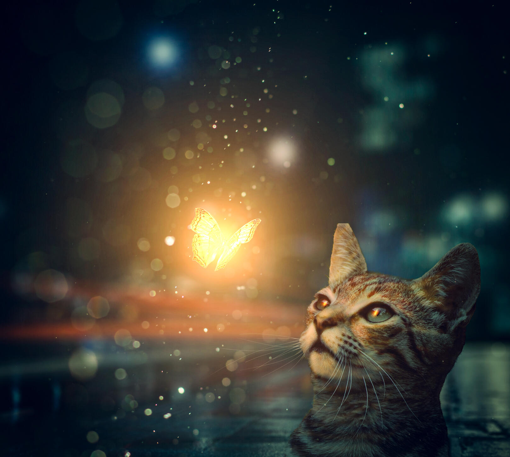
Image Editing and Manipulation
This is the first instance of graphic design that I really got stuck into. I completed this in my spare time at college following a tutorial.Overall im really impressed with how hard i worked on it and how great it turned out. It look me quite some time as this image is what helped me learn how to use photoshop effectively.I also ended up hand drawing the whiskers on the cat myself as they were cropped out during the masking process.

This is a typography task where I had to think of words to describe the animal of my choosing. In this case I chose a wolf, and researched words that relate to it.


